Color Stories and Aesthetic Shifts: Decoding Visual Trends
From dopamine brights to muted earths, color stories signal cultural mood shifts. Learn how brands decode palettes to stay relevant and resonant.
Palette as Narrative
Every visual campaign tells a story, and its first language is color. Strategic color stories transform palettes into plotlines, guiding perception before a single word is read. Warm hues pulse with energy and intimacy, while cool tones suggest calm, precision, or quiet authority. Designers sculpt emotion by balancing contrast, harmony, saturation, and value, bending temperature to evoke urgency or rest. A health brand may lean on clean, low-saturation neutrals to signal trust and clarity, while a food startup adopts ripe, high-chroma accents to telegraph freshness and flavor. In fashion visuals, moody monochromes craft introspection; in tech, crystalline gradients signal innovation-in-motion. A good palette scales across surfaces: packaging, UI, photography, and motion each receive a coherent translation. Crucially, color carries cultural baggage; meaning shifts across geographies and communities. Teams that test symbolism, validate contrast, and map semantic color to specific moments in the customer journey convert chroma into narrative momentum.
Aesthetic Pendulums
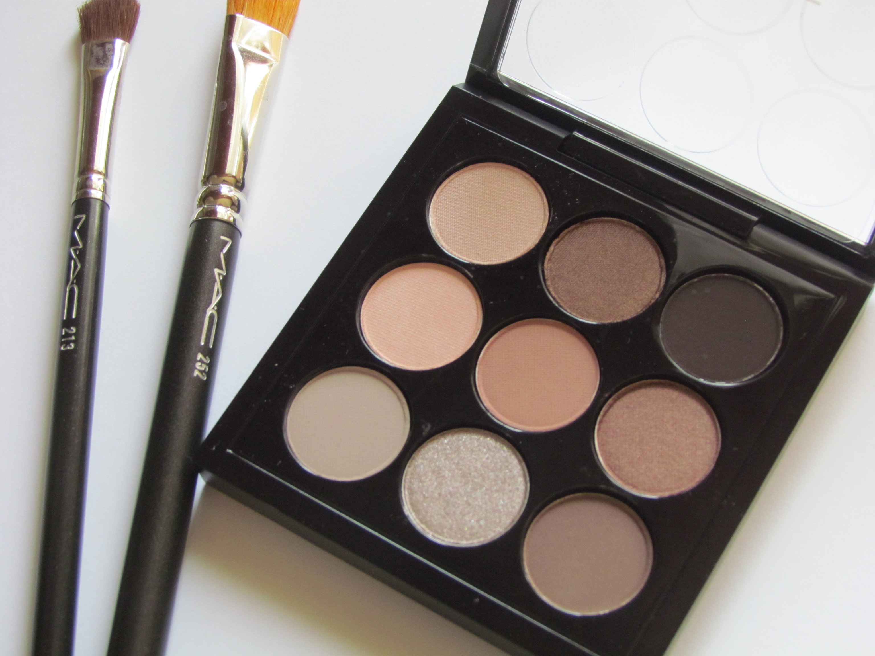
Aesthetic shifts move like tides, swinging between maximalism and minimalism, gloss and grain, order and expressive play. When screens and feeds feel loud, audiences crave quiet palettes, tactile texture, and visual breathing room; when the world feels sterile, dopamine brights, expressive type, and dense patterning surge. Current blends often split the difference, marrying futurism with nostalgia: pearly gradients meet film-like grain, chrome accents pair with handmade brushes, and clinical UI gets softened by rounded micro-shadows. These swings aren't arbitrary; they respond to emotional weather, economic signals, and shifting social rituals. Beauty and wellness tilt toward soothing earth-adjacent hues, while gaming and fintech explore electric contrasts and kinetic highlights. Across sectors, the pendulum frames risk: a restrained foundation earns trust; an audacious accent earns attention. The trick is tempo. Brands that time shifts to audience appetite—introducing novelty in measured layers, maintaining recognizable anchors—ride the wave instead of being swamped by it.
Technology as Color Engine
Technology doesn't just display color; it shapes it. HDR and wide-gamut screens widen expressive range, while robust color management ensures a palette survives the jump from camera to print to OLED. AI helps extract palette DNA from top-performing assets, cluster hues by engagement, and even propose generative families that flex across products and seasons. AR try-ons translate swatches to skin and space, collapsing guesswork into experience. Motion systems introduce kinetic color: gradients that breathe, overlays that respond to scroll, and intensity shifts that encode feedback states. Yet fidelity and flair demand responsibility. Designers benchmark contrast ratios, test in dark mode, and build adaptive themes that remain legible in sunlight or low-power states. Variable color tokens sync branding across web, app, and retail displays, while subtle micro-interactions reinforce hierarchy without visual noise. As tools evolve, the strategic question remains: how does each technical gain serve a clearer story and a calmer user journey?
Inclusive and Accessible Chromatics
Trends succeed when they include more people. Accessibility begins with contrast but goes further: do states depend solely on color, or does shape and labeling reinforce meaning? Are patterns legible for users with color-vision deficiencies? Teams simulate common variations and calibrate error, warning, and success hues against standardized contrast thresholds. Inclusivity also means cultural fluency. A triumphant red in one market can signal caution in another; ceremonial whites, celebratory golds, or sacred blues shift meanings across regions. Visuals that honor skin tone diversity—from photography lighting to foundation-matched UI overlays—build trust and realism. System features like high-contrast mode, reduced motion, and dark mode are not afterthoughts but first-order design constraints that shape the palette. Thoughtful color reduces cognitive load, clarifies actions, and supports neurodiverse processing styles. In trend work, the most modern move is often the most humane: choose hues that welcome, inform, and respect context.
Sustainable Aesthetics and Material Truth
Sustainability reshapes aesthetic trends from mood to method. Brands translate eco-values into visuals through earth-leaning palettes, mineral neutrals, and textures that reveal material honesty: recycled fiber specks, uncoated paper tooth, or matte ceramics that photograph with gentle diffusion. Print systems adopt low-ink palettes and spot colors with efficient coverage, while packaging favors substrates that age gracefully, making patina part of the story. On screens, energy-aware design leverages darker themes for OLED, reduces gratuitous glow, and balances brightness with readability. The deeper shift is cadence: chasing seasonal novelty accelerates waste, so teams cultivate timeless cores plus rotating accents that refresh without replacing. Photography leans on natural light, authentic environments, and minimal post, avoiding synthetic sheen that dates quickly. Even motion considers restraint—fewer loops, slower gradients, quieter easings—to conserve attention and power. The net effect: aesthetics that look contemporary, feel grounded, and sustain both brand and planet.
Forecasting the Next Wave
Great forecasting is part science, part storytelling. Start with signal scanning: audit runways, subcultures, retail shelves, design communities, streaming thumbnails, and interface updates. Cluster observations into a trend taxonomy—core, emergent, and fringe—and name color stories that capture mood and use-case: Restorative Neutrals, Charged Citrus, Misty Metals. Build moodboards that pair hue with materiality, typography, lighting, and motion. Prototype across touchpoints—hero banners, packaging panels, app states—and test with real users. Triangulate feedback with A/B testing, heatmaps, click maps, and qualitative interviews; track dwell time, clarity scores, and task completion. Map risks: will a palette cannibalize legibility, clash with product photos, or misalign with cultural calendars? Codify learnings as design tokens and a swatch library, documenting accessibility thresholds and localization notes. Forecasts should not predict a single future; they should furnish a portfolio of plausible directions with criteria for when to scale or sunset.
A Practical Playbook for Teams
Operationalizing trends requires discipline. Begin with a visual audit: what hues dominate, where does contrast fail, which assets overperform? Define a hero hue, two to three accents, and a supportive neutral ramp. Translate these into design tokens—base, interactive, semantic—then generate light and dark themes. Build components that express color purposefully: CTAs, alerts, dividers, data viz. Document do/don't rules, minimum contrast, and motion limits in your design system, plus localization guidance for cultural color shifts. Pilot updates in one channel, measure KPIs (conversion, clarity, retention), and run A/B variants to tune saturation and luminance. Partner with photography to align wardrobe, set design, and lighting to the palette; synchronize packaging inks and fabric dyes for real-world fidelity. Establish a quarterly cadence for micro-refreshes—accent swaps, gradient tweaks—while protecting core identifiers. The goal is momentum without whiplash: evolving aesthetics that compound brand equity over time.